Now that my internship at the University of Chicago Conte Center for Computational Neuropsychiatric Genomics is over, I’m home in Indiana for a week before heading back to Bloomington for the start of university. During the last week of the internship, I received a great deal of praise for my project presentation. I’m very grateful for the appreciation of those who enjoyed it, and, since I spend a great deal of time putting it together, I’d like to talk about how scientists should make presentations (whether that presentation is a powerpoint, poster, talk, or anything similar).
Aesthetics is key. Choose an appropriate color scheme that is both eye-catching and practical. When preparing a presentation in front of a large audience, light words on dark backgrounds are visually relaxing. Solid white on black might be a bit painful, but bright or gray-ish colors flow better. Dark words on light backgrounds require a bit more focus and energy to read, but may be ideal for diagrams, figures, and pictures. And, if you are designing a poster (not a presentation), then you would want the audience to spend more time reading your text like it is an essay or a short novel, and, therefore, one might opt for darker text on a lighter background. If there is any doubt, choosing a background that is gray-ish or somewhere in-between light and dark may be a good option, as well.
Orange and cyan complement each other well. Each bullet point is highlighted in orange when it is covered in the presentation.
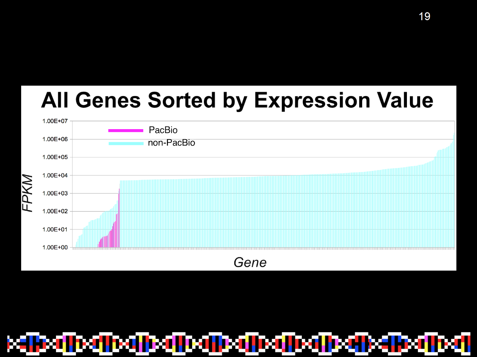
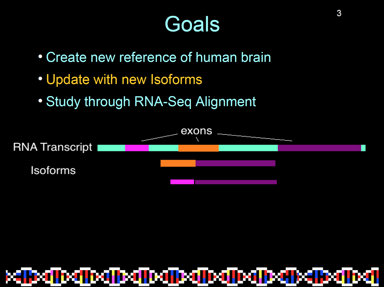 Appropriately labeled diagrams are shown large and clear. |
Go big. Make everything about your titles, axes, figures, diagrams as big as possible without interfering with other parts of your project. The bigger it is, the easier it is for people to read.
Details are important. If pictures don’t have adequate space between them or text isn’t properly aligned with its slide on a powerpoint, then that might (read: will) make a difference to how people perceive your presentation.

Use Trial and Error. When I was designing my slides, I would sometimes go through about 5 or 6 different arrangements of pictures, text, and graphs until I was satisfied. Between each edit, I had to take a step back to get an idea of how well part of my project would flow with other parts and what type of impression was given off.