Is the singularity approaching? Science and philosophy have raised possible answers. We can now scan human brains on the level of a molecule. Recording this data is only a step toward artificial immortality, some argue, where we’d exist forever in data. This data would provide the basis for emulating everything the brain normally would whether through a robotic body or a virtual being. Though it wouldn’t be the exact molecules that make up who you are, this digital copy of yourself could, in some ways, be you.
Such ideas open up questions of metaphysics and being about how possible it is to even upload minds to computers. If you’re having doubts about whether a mind can actually become completely digital, you probably won’t be surprised to hear there’s been debate. Even if you could upload your mind to a computer, it would be a matter of arranging all the molecules the way to match your mind. It raises the question of whether this can account for everything a mind is capable. But, if your identity remained, would it still be you?
In “The Singularity: A Philosophical Analysis,” David Chalmers wrote about how a computer may take someone’s uploaded mind or even follow someone’s social media feed in reconstructing everything about who they are. Philosopher Mark Walker talked about a “type identity” that mind uploading preserves. Mental events can have these types corresponding to physical events of the brain. Philosopher John Searle has argued that mind uploading, part of starting a computer program, couldn’t lead to a computer consciously thinking. He goes into more detail with his Chinese room argument. Others like philosopher Massimo Pigliucci have been more pessimistic. Pigliucci has argued consciousness as a biological phenomena don’t let it lend itself to mind uploading as others may argue. Even more pressing, the philosophers Joseph Corabi and Susan Schneider believe you possibly wouldn’t even survive being uploaded.
Despite these issues, scientists and philosophers have put forward effort to make this future a possibility. Director of Engineering at Google Ray Kurzweil has worked toward this immortality. In the hopes of surviving until the singularity, he has written on the possibility of machines reaching human-like intelligence by 2045. These “transhumanists” like philosopher Nick Bostrom argue we’ll see mind uploading technology during the 21st century. The nonprofit Carbon Copies, headed by neuroscientist Randal Koene, has directed efforts towards mind uploading.
Mind uploading also centers on the question of what you are, philosophy Kenneth Hayworth suggests. With personal identity some consider the most important target to preserve through mind uploading and using the mind to define personal identity, many have chosen to use the phrase “personal transfer to a synthetic human” (PTSH) in lieu of “mind uploading.” This has lead philosophers to argue what would constitute a “personal identity.”
Work in mind uploading should remain conscious of the ethics of various outcomes for the offspring of one another. Seeking the best outcomes for mankind as a whole could mean that the more optimistic about mind uploading may believe the process would produce more intellectual and social good for the species. Humanity progressing towards a future dominated by uploading like a transhumanist or posthumanist would. They may even overpower others and thrive in a futuristic “digital Darwinistic” scenario. Those more wary and cautious of the technology would be cast aside even if humans might go extinct. Or they may be deleted without any sort of backup. In any case, the rest would be history, and, perhaps, a bit of metaphysics.
Zellini’s book is a nice story about numbers that introduces you to new ways of looking at the world.
The answer may lie in Irish mathematician Paolo Zellini’s recent book The Mathematics of the Gods and the Algorithms of Men: A Cultural History. The philosophical debate determines to answer the question if numbers are discovered like a diamond in a cave or invented like a new phone. Whether numbers are real or fake, it doesn’t make a difference to most people, even those who use mathematics in their everyday lives. An engineer needs to know if the physics of a bridge are sturdy enough, but probably doesn’t need to know whether those physics were invented or discovered. Still, understanding that it’s not relevant to most issues means that you can appreciate a greater philosophical inquiry by approaching the problem. Figuring it out for what it is presents those new methods of reasoning. When there’s nothing practical to gain, then the real learning begins.
So where did mathematics come from? How did we start using numbers to count things? Zellini says that, historically, “2 apples” came before the number 2 did. We saw many things in front of us and used numbers to count them. Enumeration itself was meant to give reality to these things. Mathematics and numbers were powerful, and this attribution gave them their power. Philosophers who wrote about divinity believed numbers created this reality through divine powers, as Zellini explains in The Mathematics of the Gods and the Algorithms of Men.
So if math was from the Gods, were algorithms from the men? In some way. The debates throughout the 1800s and 1900s lead to the theories of computer science in solving algorithms and difficult math problems. The ways numbers behaved in different calculations were the basis for questions of how things can change or not. Einstein’s theories of relativity and developments in the creation of computers took advantage of these methods of thinking. There, the foundation of mathematics in science and technology is apparent. But Zellini takes things a step further. Math not only showed how important calculations are to society, but dictated fundemental searches for what is real.
Numbers have a reality. This isn’t the same reality as the difference between real and imaginary numbers (such as the imaginary i unit). It’s a reality of how these numbers came about. They tell us what is and isn’t. Zellini writes their “calculability,” or this mathematical practicality, determines this. These theoretical questions of what kinds of math problems can be solved or how algorithms behave speak to how a system of rules for numbers may work. Zellini is very careful not to draw too many conclusions that math is the sole method of understanding reality or that these revelations will change every field of research that uses numbers. Instead, he presents more of a guide for how the amount of money you have in your pocket or temperature forecast tomorrow are real enough for the purposes they serve, even if other numbers aren’t as real.
Zellini’s writing is still insightful and relevant, though. Numbers are different from what they enumerate. The power of hundreds of thousands of voters supporting one candidate over the other relies on calculations in an increasingly data-driven world. The models built upon machine learning and statistics depend upon all sources of information. This data comes from a small part of our experience, though. The algorithms and computers that control the analysis, prediction, and other methods create the reality that can dominate the experience they claim to represent. As we rely increasingly on forecasts and cost-benefit models of risks, we, in many ways, find ourselves turning back to the philosophical power of numbers. Back to the big questions of what a 50% win chance in an election means adds up, Zellini reveals.
It’s disappointing, then, that Zellini’s appeal to philosophy depends so much on ancient mathematics that don’t flow so well with the philosophy itself. Making strong references to Heidegger and Nietzsche and a rambling explanation from classical philosophy are fine, but the work still falls short. It stays too well within the intellectual landscape of dead white men in a way that it doesn’t represent numbers, calculation, and algorithms as well as it could. The connections between mathematics and philosophy are still weak. Zellini even makes incorrect historical claims about the cultural history of math and philosophy.
I’m sure there are better stories of the history of mathematics and philosophy such historian David Wootton’s The Invention of Science: A New History of the Scientific Revolution. Still, Zellini’s explanation of the power of numbers is difficult to ignore in today’s issues of population and economics.
A theoretical physicist can sit at a computer with a pen and paper may not seem like a likely candidate to understanding how the brain works, but, according to physicists who study statistics and algebra, they can figure out revolutionary theories about how the nervous system works. When I met Princeton theoretical physicist William Bialek in 2013 during my undergraduate years at Indiana University-Bloomington, I asked him about the “magic” of physics and how scientist can capture abstract ways of thinking and apply them to how neurons in the brain work. Bialek’s book “Spikes: Exploring the Neural Code,” one of my inspirations to step into neuroscience research, and his work alongside other researchers in physics and mathematics can answer key questions in neuroscience.
Pairwise Interactions
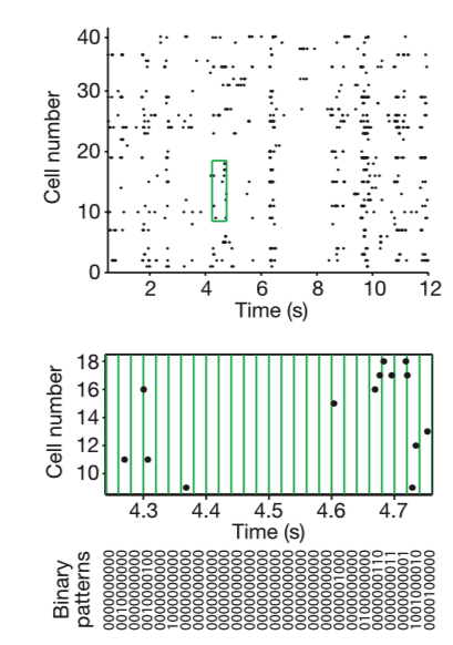
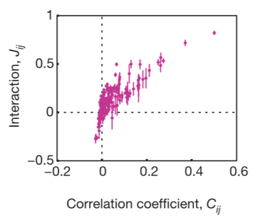
Often in neuroscience we are confronted with a small sample measurement of a few neurons from a large population. Although many have assumed, few have actually asked: What are we missing here? What does recording a few neurons really tell you about the entire network? Correlations of neurons dominated large networks of neurons. Using Ising models from statistical physics, the researchers of Schneidman et al. 2006 looked at large networks and their ability to correct for errors in representing sensory data. They argue that correlations are due to pairwise, but not 3-wise interactions between neurons, although some might argue that closer inspection reveals otherwise. Pairwise interactions are how neurons forms pairs among themselves to act together. Their pairwise maximum entropy approach can capture the activity of RGB neurons effectively.
Using an elegant preparation retina on a micro electrode array (MEA) viewing defined scenes/stimuli, the researchers showed that statistical physics models that assume pairwise correlations, but disregard any higher order phenomena, perform very well in modeling the data. This indicates a certain redundancy exists in the neural code. The results are also replicated with cultured cortical neurons on a MEA. They noted a dominance of pairwise interactions. This would imply that learning rules depending on pairwise correlations could, on their own, create nearly optimal internal models describing how the retina computes codewords. The brain could, then, assess new events for their degree of surprise with reasonable accuracy. The central nervous system alone could learn the maximum entropy model from the data provided by the retina alone, but the conditionally independent model is not biologically realistic in this sense. Although the pairwise correlations are small and weak and the multi-neuron deviations from independence are large, the maximum entropy model consistent with the pairwise correlations captures almost all of the structure in the distribution of responses from the full population of neurons. The weak pairwise correlations imply strongly correlated states.
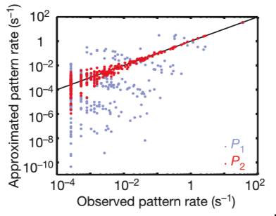
If you modeled the cells independent from one another, they would form the Poisson distribution. The actual distribution is almost exponential, so this doesn’t fit well. For example, the probability of K = 10 neurons spiking together is ~105 x larger than expected in the independent model. For this model, the specific response patterns across the population of neurons show that the N-letter binaries (patterns of 0s and 1s) differ greatly from the experimental results. These discrepancies show the failure of independent coding. The difference between prediction and empirical observation is anti-correlated in clusters of spikes.
Instead, a group of neurons comes to a decision through pairwise correlations. These rates are predicted with >10% accuracy. The rates scatter between predictions and observations is confined largely to rare events for which the measurement of rates is itself uncertain.
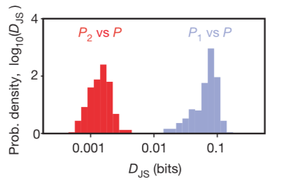
The Jensen–Shannon divergence measures similarity between two probability distributions. This metric can be used to measure mutual information of a random variable to an associated mixture distribution, as the researchers did. In previous work, the researchers had used the same principle to a joint distribution and the product of its two marginal distributions and measure how reliably you can decide if a given response comes from the joint distribution or the product distribution.
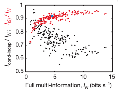
The fractions of full network correlations in 10-cell groups the maximum entropy model of second order plotted as a function of the full network correlation, measured by the multi-information IN. The ratio is larger when IN itself is larger, so that the pairwise model is more effective in describing populations of cells with stronger correlations, and the ability of this model to capture ~90% of the multi-information holds independent of many details.
The Maximum Entropy Method
Maximum entropy estimate: constructive criterion for setting up probability distributions, on the basis of partial knowledge.
The most general description of the population activity of n neurons, which uses all possible correlation functions among cells, can be written using the maximum entropy principle as shown in the equation above for a probability p̂, Lagrange multipliers hi, and Jij, Z as the normalization constant, and the other variables representing each individual event probability. This method also uses Laplace’s principle of insufficient reason, which states that two events are to be assigned equal probabilities if there is no reason to think otherwise, and Jayne’s principle of maximum entropy, the idea that distributions are determined so as to maximize the entropy (as a measure of uncertainty) in a way consistent with given measurements.
For N neurons, the maximum entropy distributions with Kth-order correlations (K=1, 2, …N) can account for the interactions. Entropy difference (multi-information) IN = S1 – SN measures the total amount of correlation in the network, independent of whether it arises from pairwise, triplet or more-complex correlations. They found this across organisms, network sizes, appropriate bin sizes, Each entropy value SK decreases monotonically toward the true entropy S : S1 ≥ S2 ≥,… ≥ SN. The contribution of the Kth-order correlation is I(K) = SK-1 – SK and is always positive. More correlation always decreases entropy.
In a physical system, the maximum entropy distribution is the Boltzmann distribution, and the behavior of the system depends on the temperature, T. For the network of neurons, there is no real temperature, but the statistical mechanics of the Ising model predicts that when all pairs of elements interact, increasing the number of elements while fixing the typical strength of interactions is equivalent to lowering the temperature, T, in a physical system of fixed size, N. This mapping predicts that correlations will be even more important in larger groups of neurons.
The active neurons are those that send an action potential down the axon in any given time window, and the inactive ones are those that do not. Because the neural activity at any one time is modelled by independent bits, Hopfield suggested that a dynamical Ising model would provide a first approximation to a neural network which is capable of learning.
The researchers looked for maximum entropy distribution consistent with experimental findings. Ising models with pairwise interactions are the least structured, or maximum-entropy, probability distributions that exactly reproduce measured pairwise correlations between spins. Schneidman and the researchers used such models to describe the correlated spiking activity of populations of neurons in the salamander retina subjected to naturalistic stimuli. They showed that for groups of N≈10 neurons (which can be fully sampled during a typical experiment) these models with O(N2) tunable parameters provide a good description of the full distribution over 2N possible states.
They found the maximum entropy model of second order captures over 95% of the multi-information in experiments on cultured networks of cortical neurons. There would be implications for learning rules could be enough to generate nearly optimal internal models for the distribution of “codewords” in the retinal vocabulary and let the brain accurately evaluate new events for their degree of surprise.
Accounting for Cell Bias
The researchers noted they needed to account for the pairwise interactions and cell bias values. Interactions have different signs, the researchers showed that frustration would prevent the system from freezing into a single state in about 40% of all triplets. With enough minimum energy patterns, the system has a representational capacity, and the network can identify the whole pattern uniquely just as Hopfield models of associative memory do. The system would have a holographic or error-correcting property, so that an observer who has access only to a fraction of the neurons would nonetheless be able to reconstruct the activity of the whole population.
The pairwise correlation model also uncovers subtle biases in decision making. It will tell you about how they influence each other, on average. Pairwise maximum entropy models reveal that the code relies on strongly correlated network states and shows distributed error-correcting structure.
To figure out if the pairwise correlations are an effective description of the system, you need to determine if the reduction in entropy from the correlations captures all or most of the multi-information IN. The researchers conclude that, even if the pairwise correlations are small and the multi-neuron deviations from independence are large, the maximum entropy model consistent with the pairwise correlations captures almost all of the structure in the distribution of responses from the full population of neurons. This means the weak pairwise correlations imply strongly correlated states.
Other Effects
Intrinsic bias dominates small groups of cells, but, in large groups, almost all of the ~N2 pairs of cells are significantly interacting (top). This shifts the balance so that the typical values of the intrinsic bias are reduced while the effective field contributed by other cells increases (bottom). In the Ising model, if all pairs of cells interact significantly with one another, you can limit the typical size of interactions by showing how Jij changes with increasing N. There were no signs of significant changes in J with growing N with the values the researchers tested.
Extrapolation
For weak correlations, you can solve the Ising model in perturbation theory to show that the multi-information IN is the sum of mutual information terms between all pairs of cells, and IN ~ N(N – 1) (left). This is in agreement with the empirically estimated IN up to N = 15, the largest value for which direct sampling of the data provides a good estimate. Monte Carlo simulations of the maximum entropy models suggest that this agreement extends up to the full population of N = 40 neurons in their experiment (G. Tkačik, E.S., R.S., M.J.B. and W.B., unpublished data). The potential for extrapolation to larger networks of neurons can be shown through the error-correction that comes about (right). The error-correction emerges when figuring out how N-cell activity can predict (N+1)-cell activity. Uncertainty decreases by the number of cells. In a 40-cell population, three cells with spiking probability have an near-perfect linear encoding of the number of spikes generated by other cells in the network. Through these methods of becoming more and more accurate and robust, they showed findings that are similar to how single pyramidal cell spiking correlates with more collective responses.
Challenges to the Model
The case of two correlated neurons has proven to be particularly challenging, because the Fokker–Planck equations are analytically tractable only in the linear regime of correlation strengths (r ≈ 0) and only for a limited set of current correlation functions. Some analytical results for the spike cross-correlation function have been obtained using advanced approximation techniques for the probability density and expressed as an infinite sum of implicit functions (Moreno-Bote and Parga, 2004, 2006). Similarly, the correlation coefficient of two weakly correlated leaky-integrate-and-fire neurons has been obtained for identical neurons in the limit of large time bins.
Correlations between neurons can occur at various timescales. It’s possible, by integrating the cross-correlation function (xcorr in Matlab, correlate in numpy) between two neurons, to read off the timescale of the correlation (Bair, Zohary and Newsome 2001). This can help to distinguish correlations due to monosynaptic or disynaptic connections, which are visible at short timescales, with correlations due to slow drift in oscillations, up-down states, attention, etc., which occur at much longer timescales. Correlations depend on physical distance on the cortical map as well as tuning distance between two neurons (Smith and Kohn, 2008).
Decoding techniques of Ising model can be applied to simulated neural ensemble responses from a mouse visual cortex model with an improvement in decoder performance for a model with heterogeneous as opposed to homogeneous neural tuning and response properties. Their results demonstrate the practicality of using the Ising model to read out, or decode, spatial patterns of activity comprised of many hundreds of neurons (Schaub et al. 2011).
Discussion
The research seems to reflect general trends of “the whole is greater than the sum of its parts” or even “less is more,” both concepts in science and philosophy that date back centuries. I even emailed Elad Schneidman a few days ago about this, and he responded, “I think that this idea must predate the ancient greeks ;-)”.
Their work used the application of the maximum entropy formalism of Schneidman et al. 2003, to ganglion cells. The same way a group of neurons behaves differently than the sum (or combination) of each independent neuron gives the research leverage and potential for these systems-like problems of neurocomputation and emergent phenomena.
The work in deriving an Ising model (or using a maximum entropy method) from statistical mechanics shows the importance of a priori proof work in using equations and theories to deduce “what follows from what.” It’s a great example of using the principles and methods of abstraction that mathematicians and physicists use in solving problems in biology and neuroscience. In my own writing, I’ve described this sort of attention to abstract models and ideas as relevant to biology in a previous blogpost.
In this paper, the researchers very well theorized which shortcomings and limitations their model would have and addressed them appropriately by fitting their model to experimental work. As a result, their research testifies to the power of computational and theoretical research in both describing and explaining empirical phenomena.
In that same year, Tkačik and other researchers would use the same recordings and use Monte-Carlo-based methods to construct the appropriate Ising model for the complete 40-neuron dataset. They showed that pairwise interactions still account for the observed higher-order correlations and argue why the effects of three-body interactions should be suppressed.
They examined the thermodynamic properties of Ising models of various sizes derived from the data to suggest a statistical ensemble from which the observed networks could have been drawn and, consequently, to create synthetic networks of 120 neurons. They found that with increasing size the networks operate closer to a critical point and start exhibiting collective behaviors reminiscent of spin glasses. They examined more closely the appearance of multiple single-spin-flip stable states.
The method of using a maximum entropy model is equivalent to the method of Roudi et al. 2009, where they described a method of normalizing the the Kullback–Leibler divergence DKL(P, P˜) (for P˜ approximation to distribution P, with the distance from the independent maximum entropy fit. The quality of the pairwise model comes from normalizing this by the corresponding distance of the distribution P from an independent maximum entropy fit DKL(P, P1), where P1 is the highest entropy distribution consistent with the mean firing rates of the cells (equivalently, the product of single-cell marginal firing probabilities): Δ = 1 – DKL(P, P˜)/DKL(P, P1) where Δ = 1 means the pairwise model perfectly fits the additional information left out by the independent model, and Δ = 0 means the pairwise model doesn’t improve at all compared to the independent model.
In 2014, Tkačik and the researchers from Schneidman et al. 2006 published “Searching for Collective Behavior in a Large Network of Sensory Neurons” with K-pairwise models, more specialized variations of the pairwise models to estimate entropy, classify activity patterns, show that the neural codeword ensembles are extremely inhomogeneous, and demonstrate that the state of individual neurons is highly predictable from the rest of the population, which would allow for error correction.
Barreiro et al. 2014 found that, over a broad range of stimuli, output spiking patterns are surprisingly well-captured by the pairwise model. They studied an analytically tractable simplification of the retinal ganglion cell mode, and found that in the simplified model, bimodal input signals produce larger deviations from pairwise predictions than unimodal inputs. The characteristic light filtering properties of the upstream retinal ganglion cell circuitry would suppress bimodality in light stimuli, thus removing a powerful source of higher-order interactions. The researchers said this gave a novel explanation for the surprising empirical success of pairwise models.
Ostojic et al. 2009 studied how functional interactions would depend on biophysical parameters and network activity that variations in the background noise changed the amplitude of the cross-correlation function as strongly as variations of synaptic strength. They found that the postsynaptic neuron spiking regularity has a pronounced influence on cross-correlation function amplitude. This suggests an efficient and flexible mechanism for modulating functional interactions.
In 1995, Mainen & Sejnowski showed that single neurons have very reliable responses to current injections. Nevertheless, cortical neurons seem to have Poisson or supra-Poisson variability. It’s possible to find a bound on decodability using the Fisher information matrix (Sompolinsky & Seung 1993). Under the assumption of independent Poisson variability, it is possible to derive a simple scheme for ML decoding that can be implemented in neuronal populations (Jazayeri & Movshon 2006).
The accumulation of noise sources and various other mechanisms cause cortical neuronal populations to be correlated. This poses challenges for decoding. You can get a little more juice out of decoding algorithms by considering pairwise correlations (Pillow et al. 2008).
References
Bair, W. “Correlated firing in macaque visual area MT: time scales and relationship to behavior.” (2001). Journal of Neuroscience.
Barreiro, et al. “When do microcircuits produce beyond-pairwise correlations?” (2014). Frontiers.
Bialek, William and Rangnathan, Ramek. “Rediscovering the power of pairwise interactions.” (2018). Arxiv.
Hopfield, J.J. “Neural networks and physical systems with emergent collective computational abilities.” (1982). Proc. Natl Acad. Sci. USA 79, 2554–-2558.
Jazayeri, M, Movshon, A. “Optimal representation of sensory information by neural populations.” (2006). Nature Neuroscience.
Mainen, ZF, Sejnowski, TJ. “Reliability of spike timing in neocortical neurons.” (1955). Science.
Moreno-Bote, R., and Parga, N. “Role of synaptic filtering on the firing response of simple model neurons.” (2004). Phys. Rev. Lett. 92, 028102.
Moreno-Bote, R., and Parga, N. “Auto- and crosscorrelograms for the spike response of leaky integrate-and-fire neurons with slow synapses.” (2006). Phys. Rev. Lett. 96, 028101.
Ostojic, et al. “How Connectivity, Background Activity, and Synaptic Properties Shape the Cross-Correlation between Spike Trains.” (2009). The Journal of Neuroscience.
Pillow, Jonathan, et al. “Spatio-temporal correlations and visual signalling in a complete neuronal population.” (2008). Nature.
Roudi, et al. “Pairwise Maximum Entropy Models for Studying Large Biological Systems: When They Can Work and When They Can’t.” (2009). PLoS Computational Biology.
Schaub, Michael and Schultz, Simon. “The Ising decoder: reading out the activity of large neural ensembles.” (2011). Journal of Computational Neuroscience.
Schneidman et al. “Network Information and Connected Correlations.” (2003). Physical Review Letters.
Schneidman et al. “Weak pairwise correlations imply strongly correlated network states in a neural population.” (2006). Nature.
Seung, HS, Sompolinsky, H. “Simple models for reading neuronal population codes.” (1993). PNAS.
Shlens, Jonathan, et al. “The structure of multi-neuron firing patterns in primate retina” (2006). The Journal of Neuroscience 26.32: 8254-8266.
Smith, Matthew, and Kohn, Adam. “Spatial and Temporal Scales of Neuronal Correlation in Primary Visual Cortex.” (2008). Journal of Neuroscience.
Tkačik, Gašper et al. “Ising models for networks of real neurons.” (2006). arXiv.org:q-bio.NC/0611072.
Tkačik, Gašper et al. “Searching for Collective Behavior in a Large Network of Sensory Neurons.” (2014). PLoS Comput Biol.
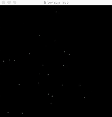
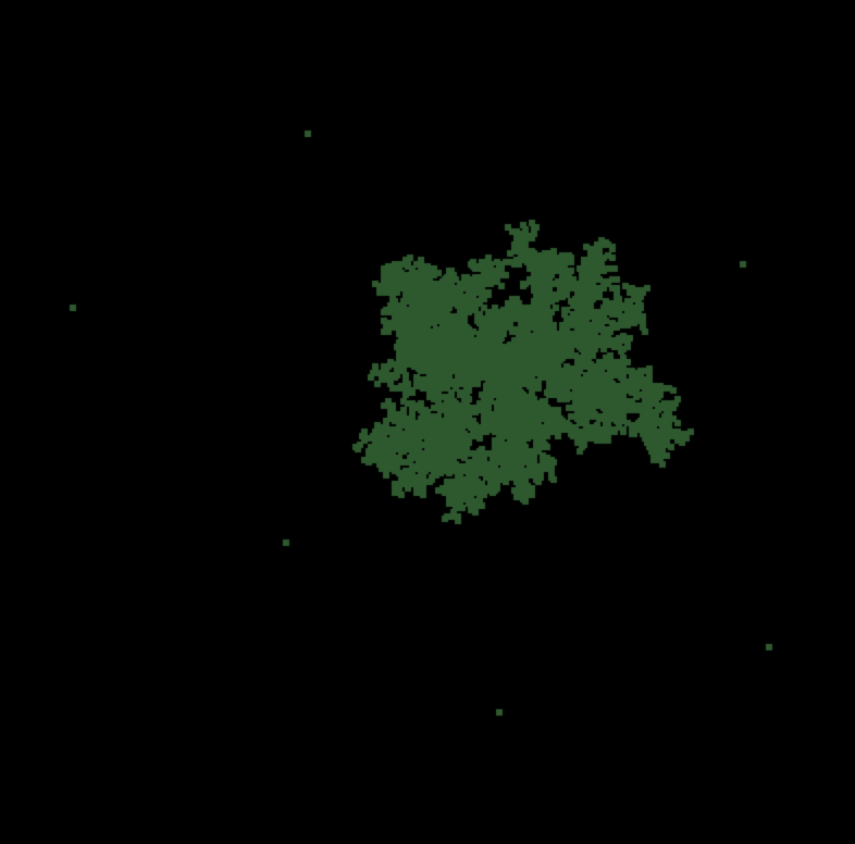
The first 30 seconds of a Brownian tree (code can be found here).
Like a flower in full bloom, nature reveals its patterns shaped by mathematics. Or as particles collide with one another, they create snowflake-like fractals through emergence. How do fish swarm in schools or consciousness come about from the brain? Simulations can provide answers.
Through code, you can simulate how living cells or physical particles would interact with one another. Using equations that govern the behavior of how cells act when they meet one another or how they would grow and evolve into larger structures. In the gif above, you can use diffusion-limited aggregation to create Brownian trees. These are the structures that emerge when particles move randomly with respect to one another. Particles in fluid (like dropping color dye into water) take these patterns when you look at them under a microscope. As the particles collide and form trees, they create shapes and patterns like water crystals on glass. These visuals can give you a way of appreciating how beautiful mathematics is. The way mathematical theory can borrow from nature and how biological communities of living organisms themselves depend on physical laws shows how such an interdisciplinary approach provides a way to bridge different disciplines.
After about 20 minutes, the branches of the Brownian tree take form.
In the code, the particles are set to move with random velocities in two dimensions and, if they collide with the tree (a central particle at the beginning), they form parts of the tree. As the tree grows bigger over time, it takes the shapes of branches the same way neurons in the brain form trees that send signals between one another. These fractals, in their uniqueness, give them a kind of mathematical beauty.
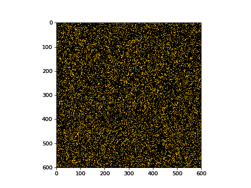
Conway’s game of life represents another way something emerges from randomness.
Flashing lights coming and going away like stars shining in the sky are more than just randomness. These models of cellular interactions are known as cellular automaton. The gif above shows an example of Conway’s game of life, a simulation of how living cells interact with one another.
These cells “live” and “die” according to four simple rules: (1) live cells with fewer than two live neighbors die, as if by underpopulation, (2) live cells with two or three live neighbors live on to the next generation, (3) live cells with more than three live neighbors die, as if by overpopulation and (4) dead cells with exactly three live neighbors become live cells, as if by reproduction.
Conus textile shows a similar cellular automaton pattern on its shell.
Through these rules, specific shapes emerge such as “gliders” or “knightships” you can further describe with rules and equations. You’ll find natural versions of cells obeying rules like the colorful patterns on a seashell. Complex structures emerging from more basic, fundamental sets of rules unite these observations. While the beauty of these structures becomes more and more apparent from the patterns between different disciplines, searching for these patterns in other contexts can be more difficult such as human behavior.
Recent writing like Genesis: The Deep Origin of Societies by biologist E.O. Wilson take on the debate over how altruism in humans evolved. While the shape of snowflakes can emerge from the interactions between water molecules, humans getting along with one another seems far more complicated and higher-level. Though you can find similar cooperation in ants and termites creating societies, how did science let this happen?
Biologists have answered that organisms choose to mate with individuals and increase the survival chances of themselves and their offspring while passing on their genes. Though they’ve argued this for decades, Wilson offers a contrary point of view. In groups, selfish organisms defeat altruistic ones, but altruistic groups beat selfish groups overall. This group selection drives the emergence of altruism. Through these arguments, both sides have appealed to the mathematics of nature, showing its growing importance in recognizing the patterns of life.
Wilson clarifies that data analysis and mathematical modeling should come second to the biology itself. Becoming experts on organisms themselves should be a priority. Regardless of what form it takes, the beauty is still there, even if it’s below the surface.